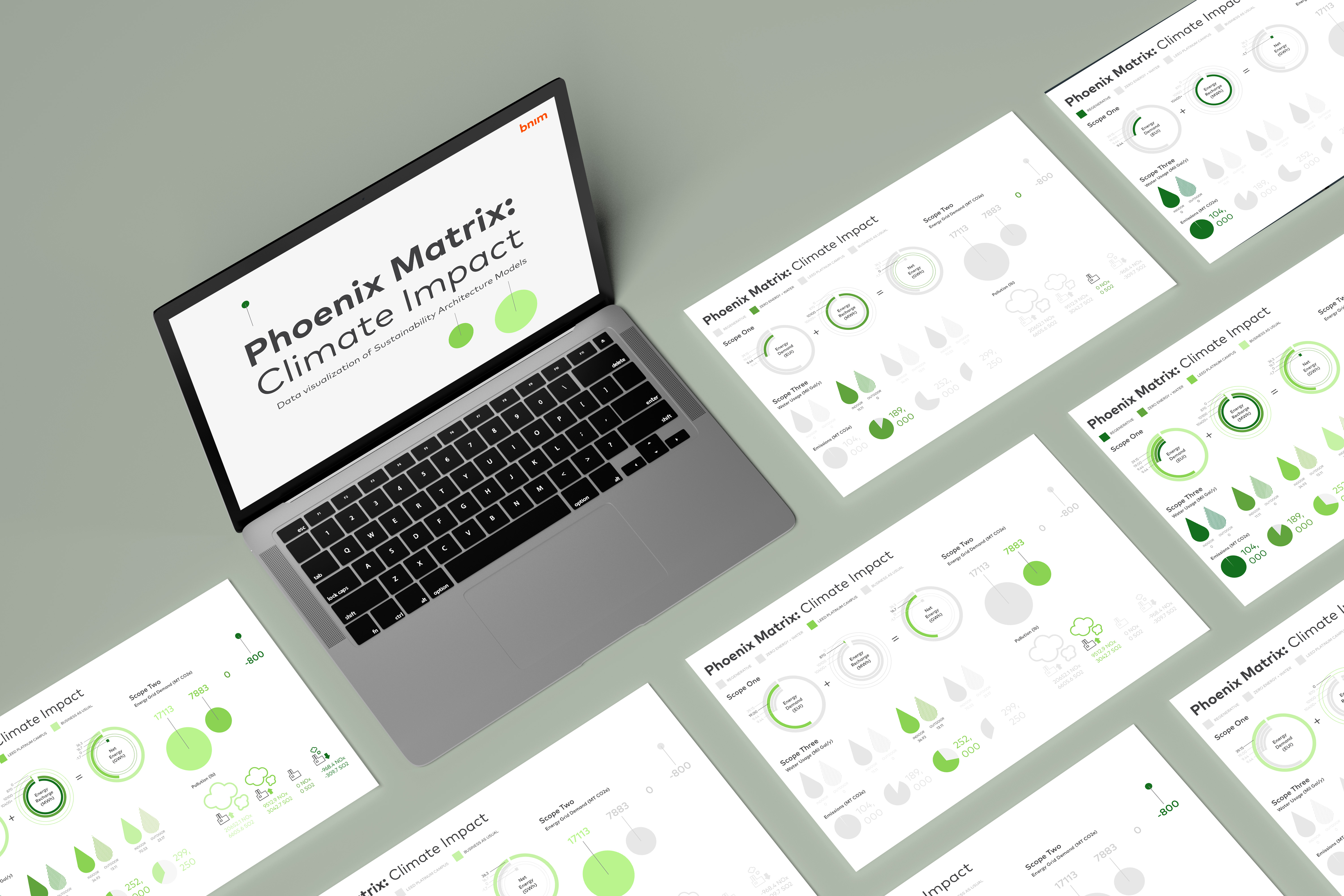
The Phoenix Matrix is a series of calculations of the cost and benefits of constructing four different sustainability building types. The types include Business as Usual (regular building), LEED Platinum, Zero Energy and Water, and Regenerative Building. The climate impact covers the three environmental scopes of architecture.
Scope 1: Direct emissions: Energy Demand, Energy Recharge, and Net Energy
The three units have an additive relationship: Energy Demand + Energy Recharge = Net Energy.
Scope 2: Indirect emissions Energy Grid Demand and Pollution
Scope 3: Water usage and construction emissions
Scope 1:
To convey the additive relationship of the three, I use a lightning symbol to correlate the three different statistics. I also use green and orange to convey the negative values (good for climate) and positive values (bad for environment)
Scope 2:
Since the rest of the scopes don’t have a direct relationship within the values, I focused on trying new and innovative ways to create representations of the design
Scope 3:
Water demand has a multitude of individual sections of types of water needed by a building
Brainstorming different ways of showing the relationship of water icons without compromising neatness and visibility
The original Phoenix Matrix is set up as a graph so my first iteration of the design reflected the graph-like nature of the matrix. With my own designed icons and representing positive and negative values using the BNIM color palette, I created a to-scale graph of the matrix. I developed new personalized icons for each of the data points.
My supervisor approve of the grid format. My icons, on the other hand, needed to be more aligned and alike for all of the categories.
My supervisors and I are satisfied with the second version due to the flexibility and interactiveness of the design. The intense idealization process laid the groundwork for the designs. It was hard, frustrating, but ultimately rewarding.
The greatest challenge I face was accessibility. The Director of Sustainability at BNIM was one of my supervisors as well. He is one of the writers of the original Phoenix Matrix and he is red-green color blind. This is the first time I’m learning to accommodate and receiving feedback from a color-blind user in real time. It instilled in me a design habit to think about accessibility while iterating.