RITA
WANG
PHOENIX MATRIX
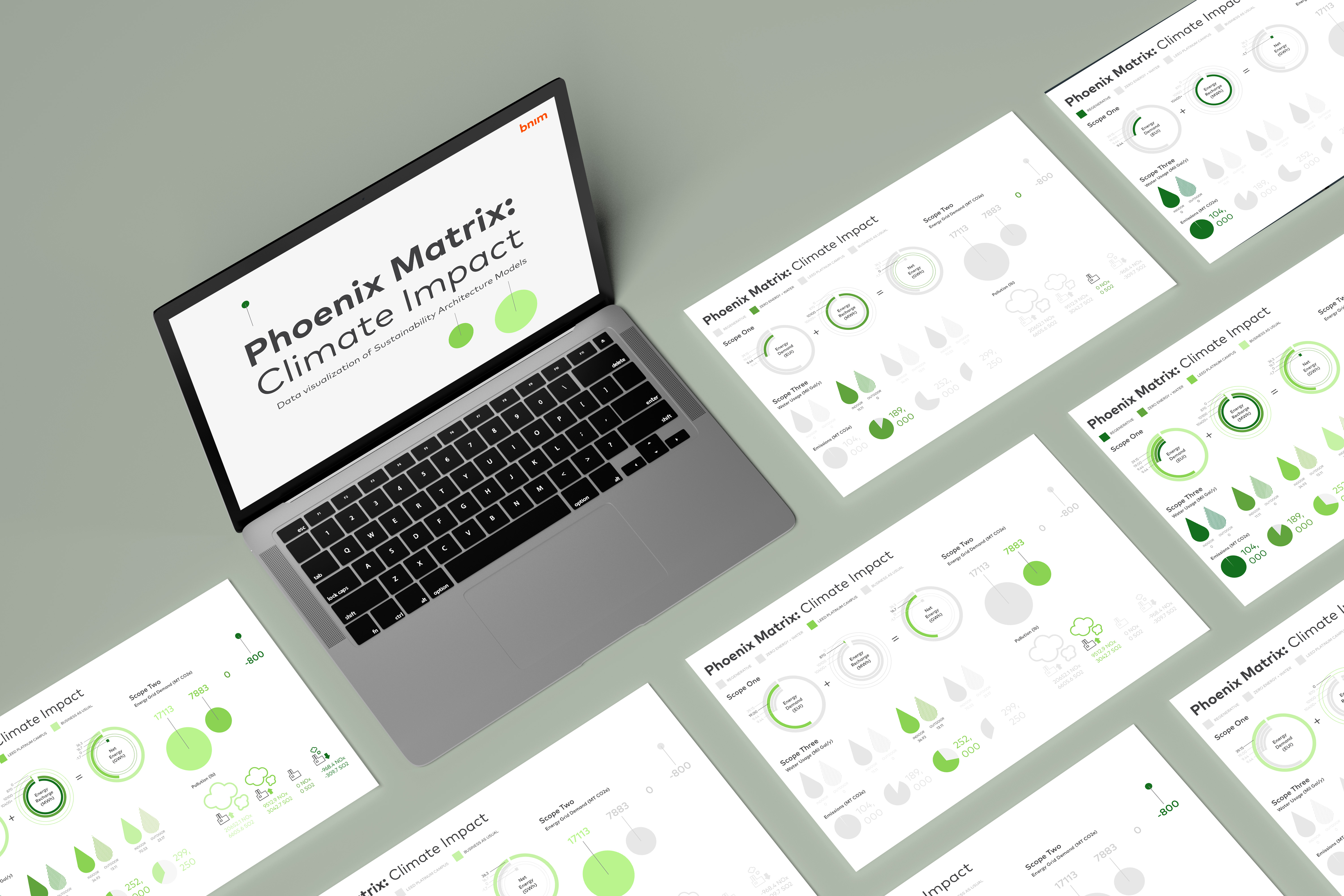
BNIM is an architecture firm based in Kansas City with a focus on sustainability. As their summer Graphic Design Intern, I worked on making a data visualization for their Phoenix Matrix tool. BNIM developed the Phoenix Matrix, a visualization table, as a way to calculate the cost and benefits of different building types.

HOW DO NON-ARCHITECTS UNDERSTAND THE CLIMATE IMPACT OF
CONSTRUCTING DIFFERENT TYPES OF BUILDINGS?
As a non-architect, I tackled the transition from...
Confusing architectural
data points
→
In-depth understanding
of climate costs
design a tool that allows for both architects and non-architects to understand the climate impact of building designs?
→ WHO'S THE AUDIENCE?
Stakeholders and clients investing in an architecture project.
→ WHAT'S THE GOAL OF THE PROJECT?
Successfully illustrate the complex intricacies of the Phoenix Matrix to non-architecture audience.
→ WHAT IS THE PHOENIX MATRIX?
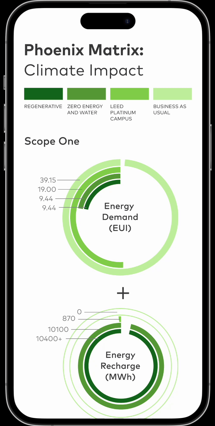
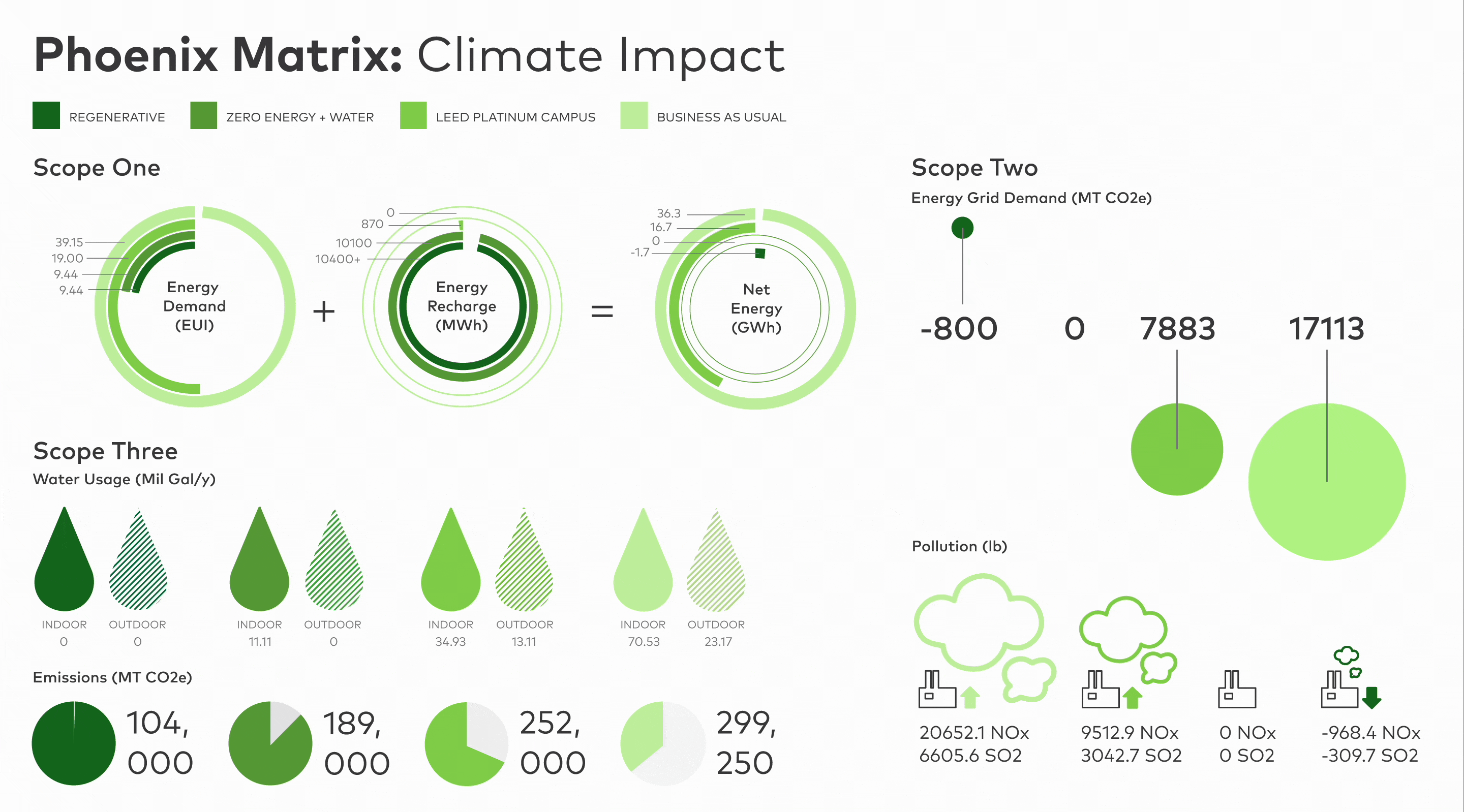
The Phoenix Matrix is a series of calculations of the cost and benefits of constructing four different sustainability building types. The types include Business as Usual (regular building), LEED Platinum, Zero Energy and Water, and Regenerative Building. The climate impact covers the three environmental scopes of architecture.
→ WHAT ARE THE SCOPES?
Climate scopes are a way of categorizing the different kinds of emissions caused by a building

SCOPE 1: Direct emissions
Energy Demand + Energy Recharge = Net Energy

SCOPE 2: Indirect emissions
Energy Grid Demand and Pollution

SCOPE 3: Water usage and construction emissions

→ SCOPE 1 SKETCHES
To convey the additive relationship of the three, I use a lightning symbol to correlate the three different statistics. I also use green and orange to convey the negative values (good for climate) and positive values (bad for environment)

→ SCOPE 2 SKETCHES
Since the rest of the scopes don’t have a direct relationship within the values, I focused on trying new and innovative ways to create representations of the design

→ SCOPE 3 SKETCHES
Water demand has a multitude of individual sections of types of water needed by a buildingBrainstorming different ways of showing the relationship of water icons without compromising neatness and visibility
→ ELEVATING DATA PRESENTATION
The original Phoenix Matrix is set up as a graph so my first iteration of the design reflected the graph-like nature of the matrix. With my own designed icons and representing positive and negative values using the BNIM color palette, I created a to-scale graph of the matrix.

While this solution is certainly understandable, it doesn't quite function as a tool and it just
... NOT ENGAGING ENOUGH
→ WEB TOOL VERSION
I prototyped the web version of the Phoenix Matrix in the last week of my internship.
I believed that the interaction of the page helps highlight the data in a way the grid format can't. By breaking out of the strict grid of the print version, the web version presents the data dynamically.
→ MOBILE TOOL VERSION
I also prototyped a mobile version of the matrix because architects want to reference the tool while they are on-site at the construction site.